nct 127
ay-yo
album repack
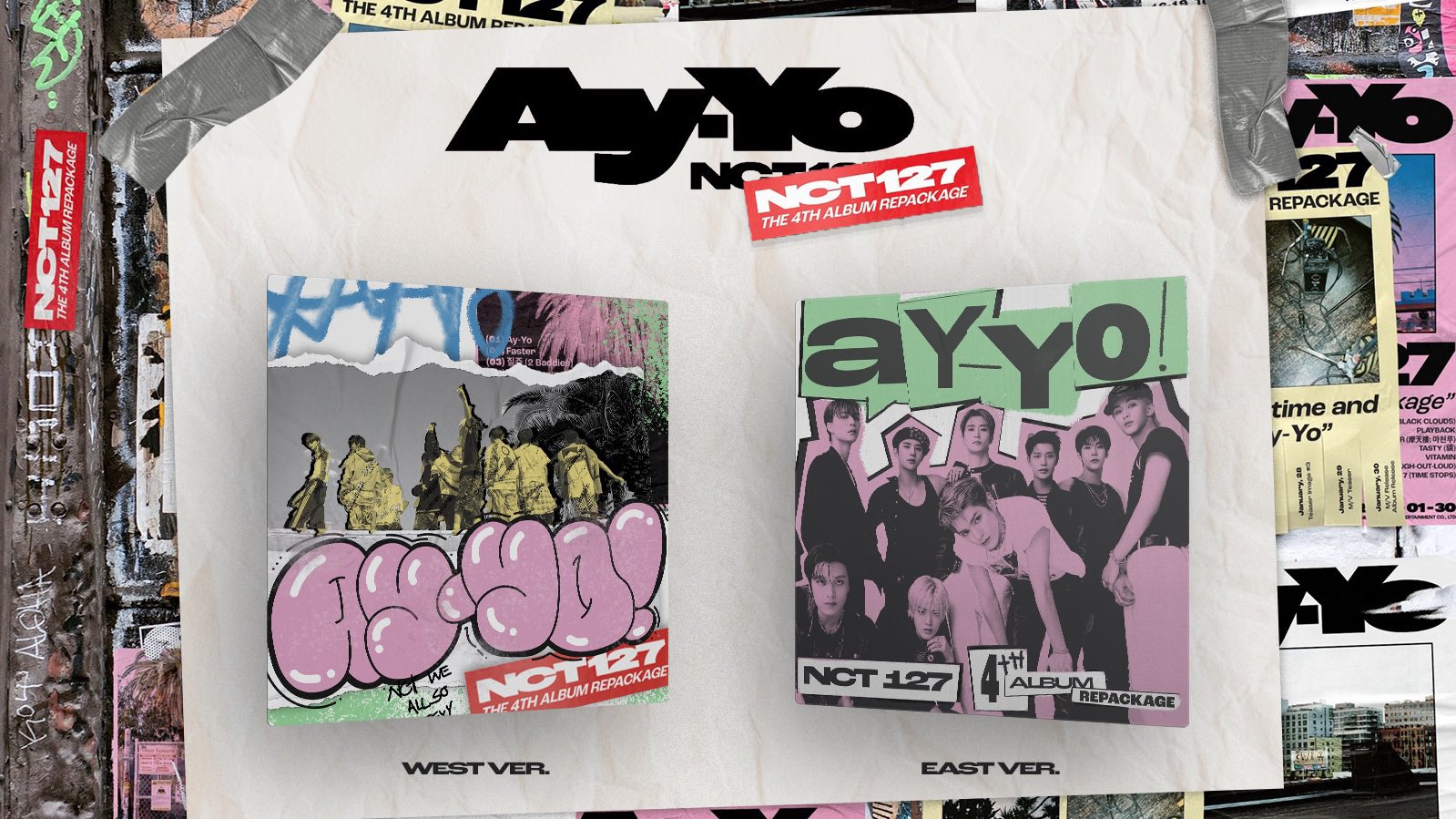
A spec redesign of the album artwork, packaging, and promotion for NCT 127's 4th Full Album Repackage "Ay-Yo"
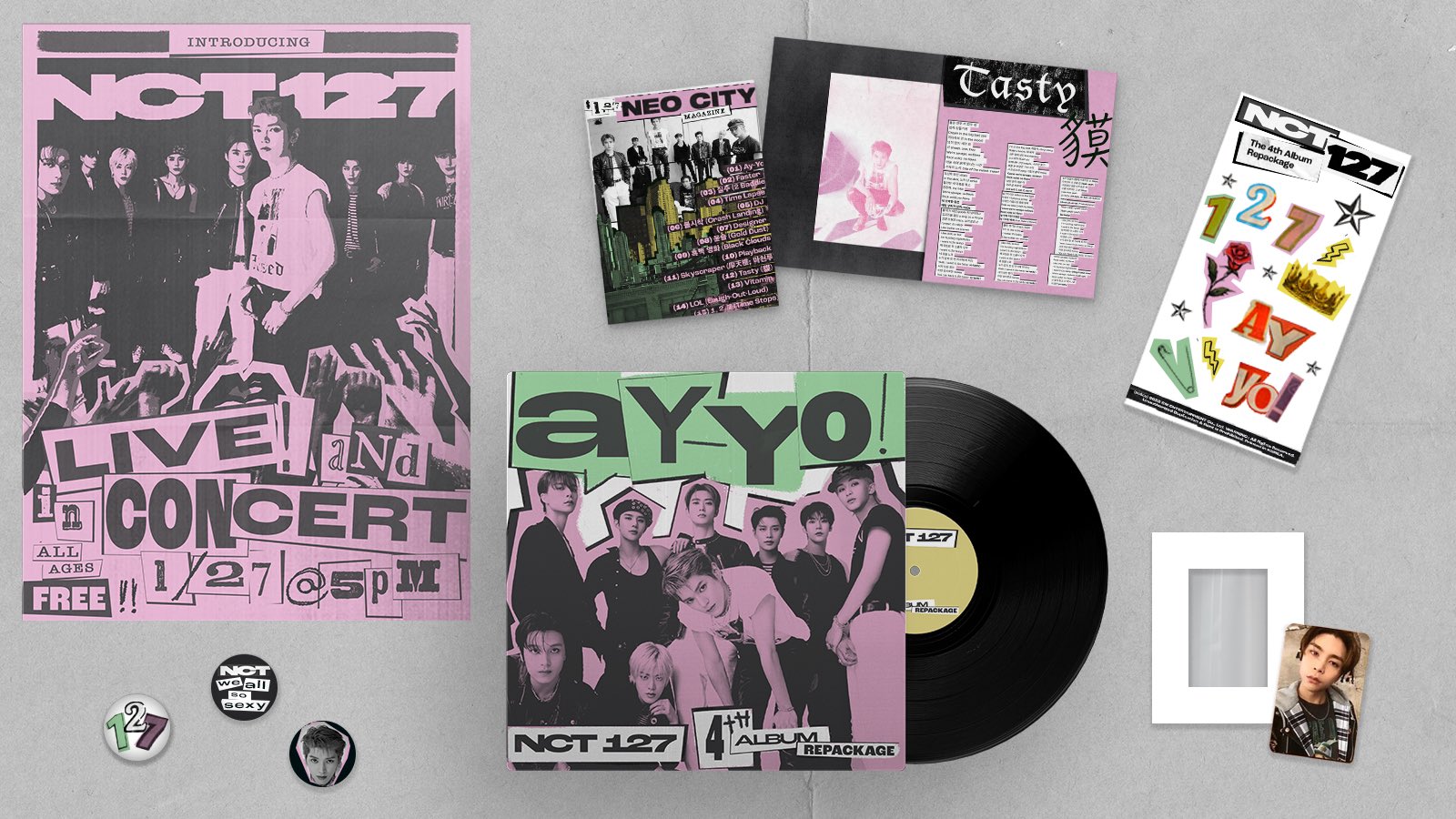
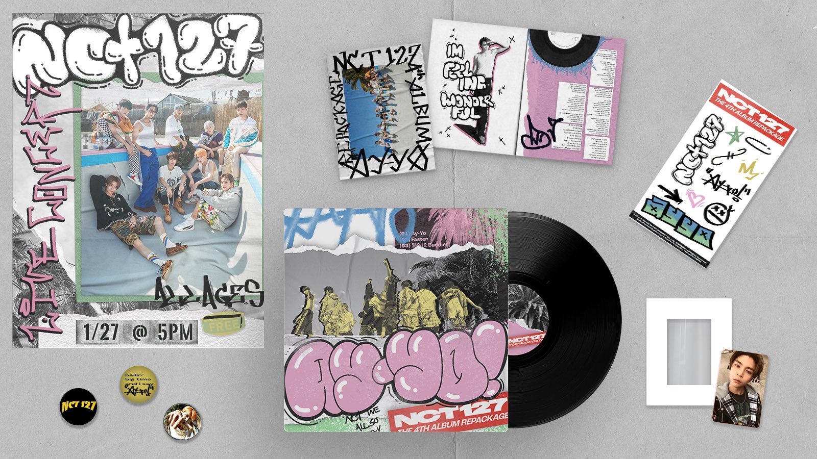
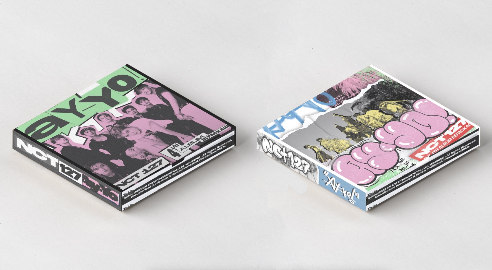
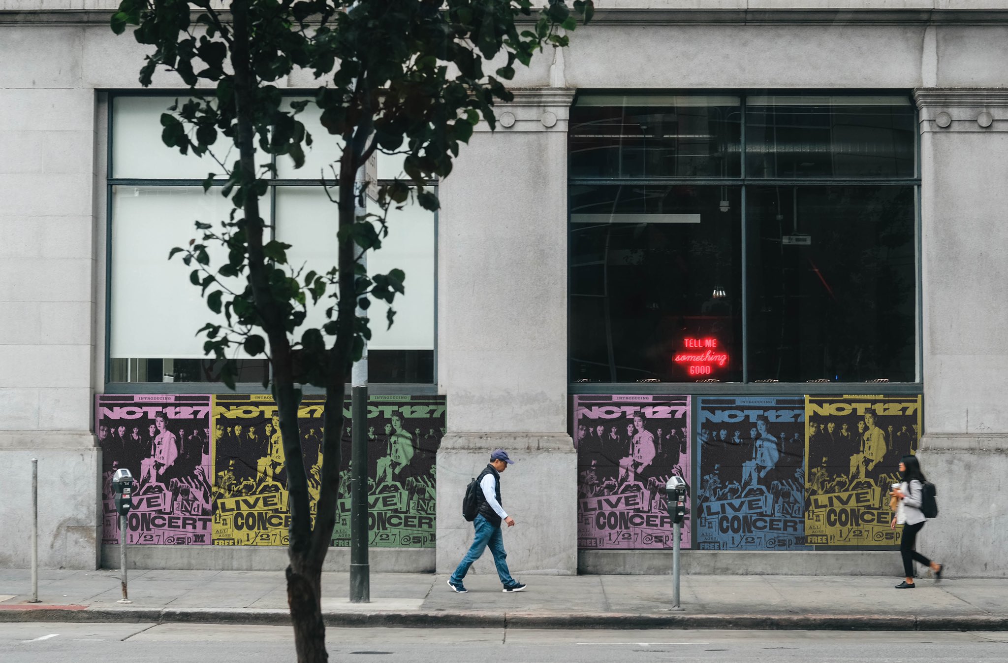
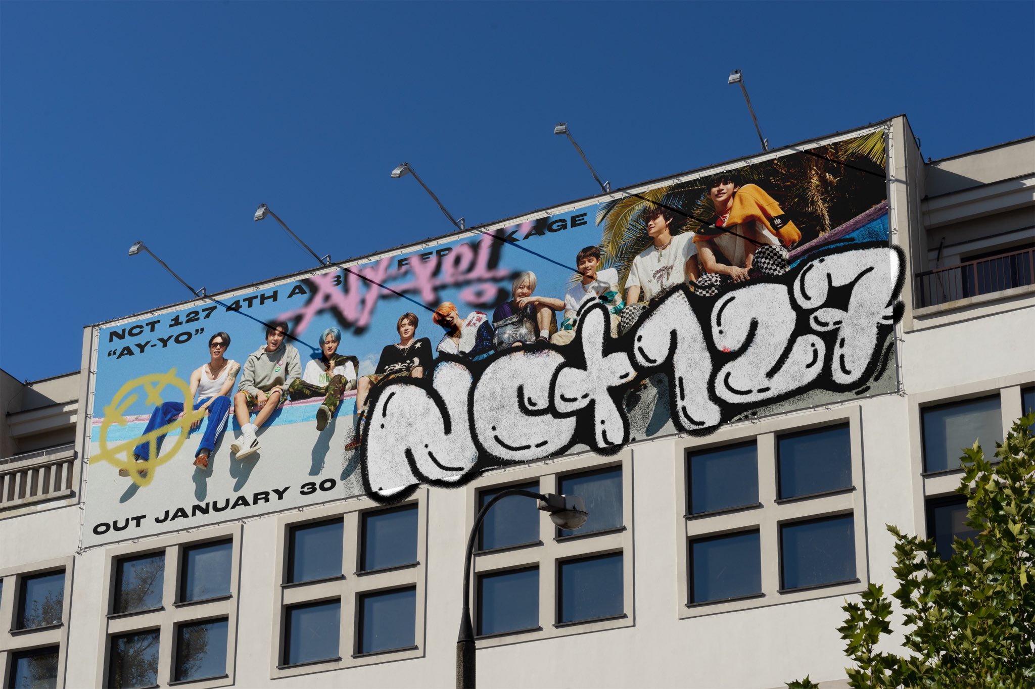
Leaning into two iconic, DIY-heavy, american subcultures: punk and skateboarding. The album would have two versions: East (punk) and West (skate). The album packaging would be inspired by the DIY nature of both- the album looks like a record sleeve, and the cd holder looks like a record. photobook is a zine, photocard + frame and sticker decorating kit, button pin pack, and a poster that looks like an underground show ad. East ver. pays homage to the New York punk scene: it’s grittier, noisier, using cut outs and photocopies and lots of bold heavy color. West ver. is the california skater scene- graffiti, Green Day, Thrasher magazine, etc. with a more handdrawn style, and a noticeably brighter and less rigid aesthetic.
Album promotions would also borrow from DIY aesthetics- wheatpasted posters, billboards and outdoor ads that look like they’ve been vandalized, and stickers or stencils on city streets.
Team:
Original album art credit to SM Entertainment
Design/Art Direction: Niamh Murphy
SEEKING SOMETHING ELSE?



 previous project