yonkers film festival
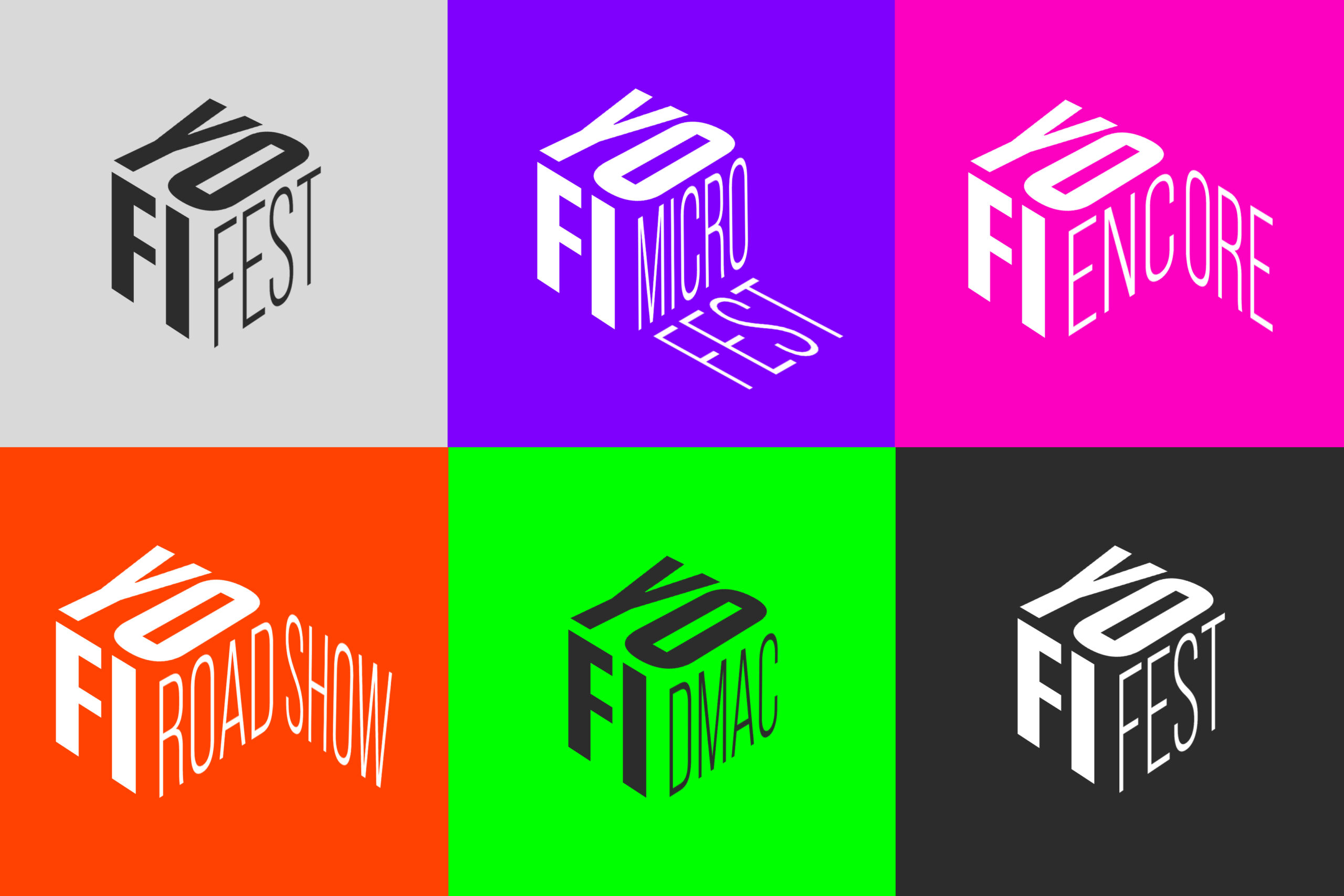
Yonkers Film Festival (YoFiFest) approached us to refresh their logo and evolve their brand system after encountering limitations with the logo they had been using since their inception. There were aspects of their logo which they were happy with — its monochrome look and playful typography — so rather than a complete overhaul, we aimed to expand on what they had and add dimension to the brand (literally!)
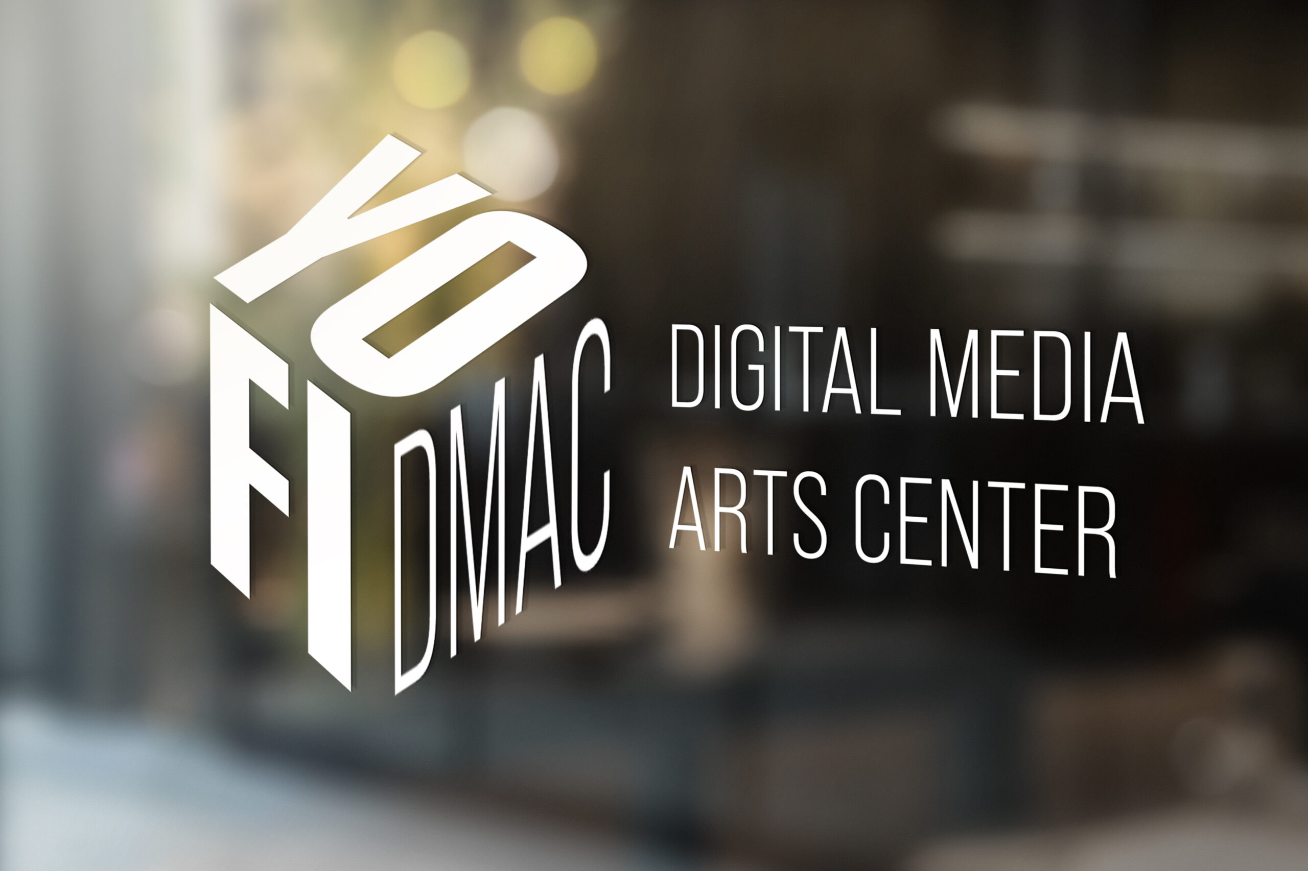
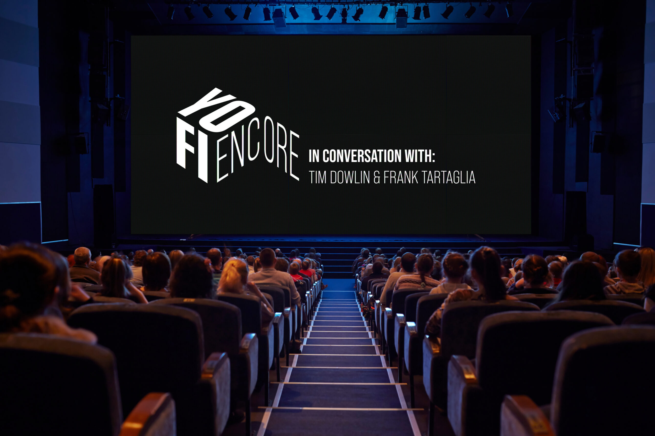
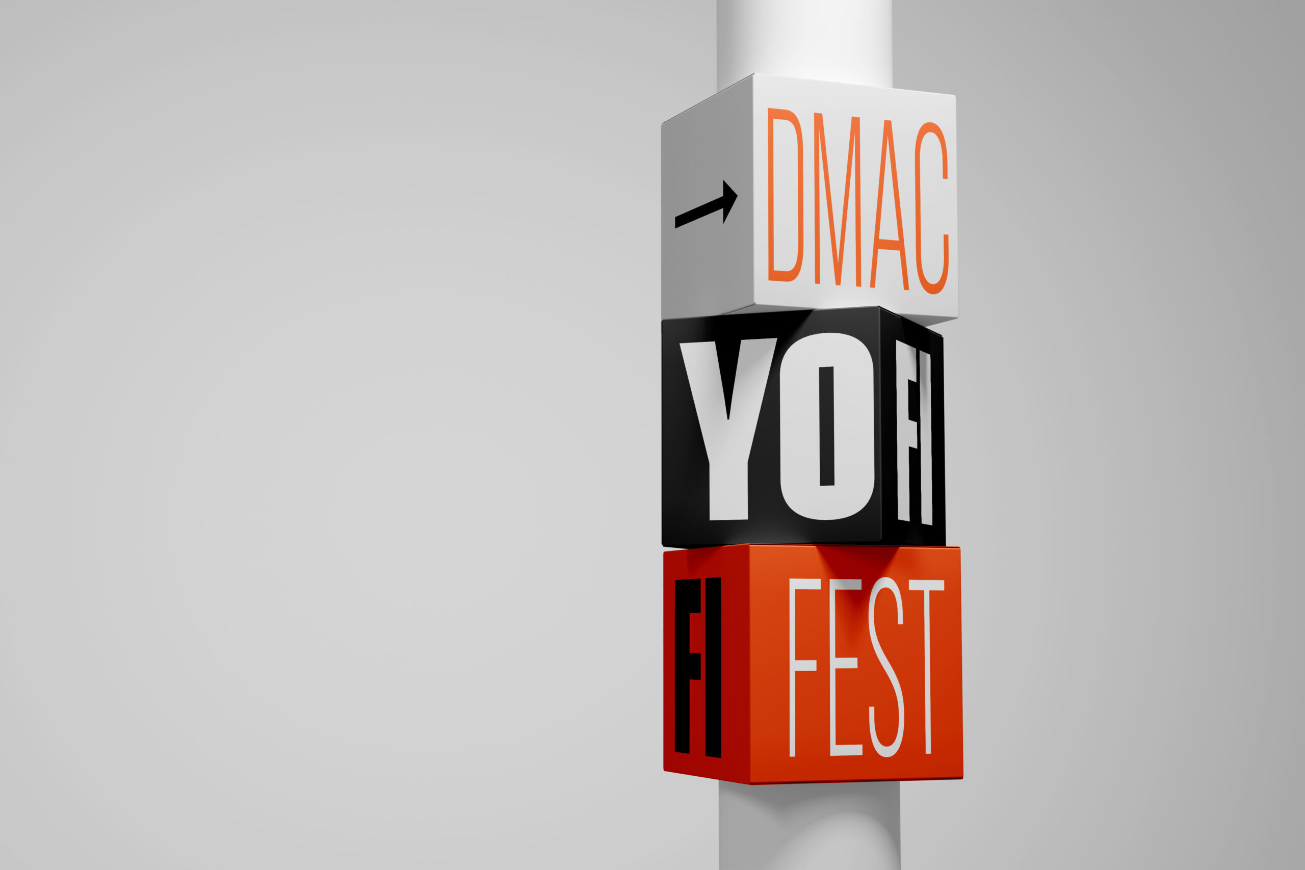
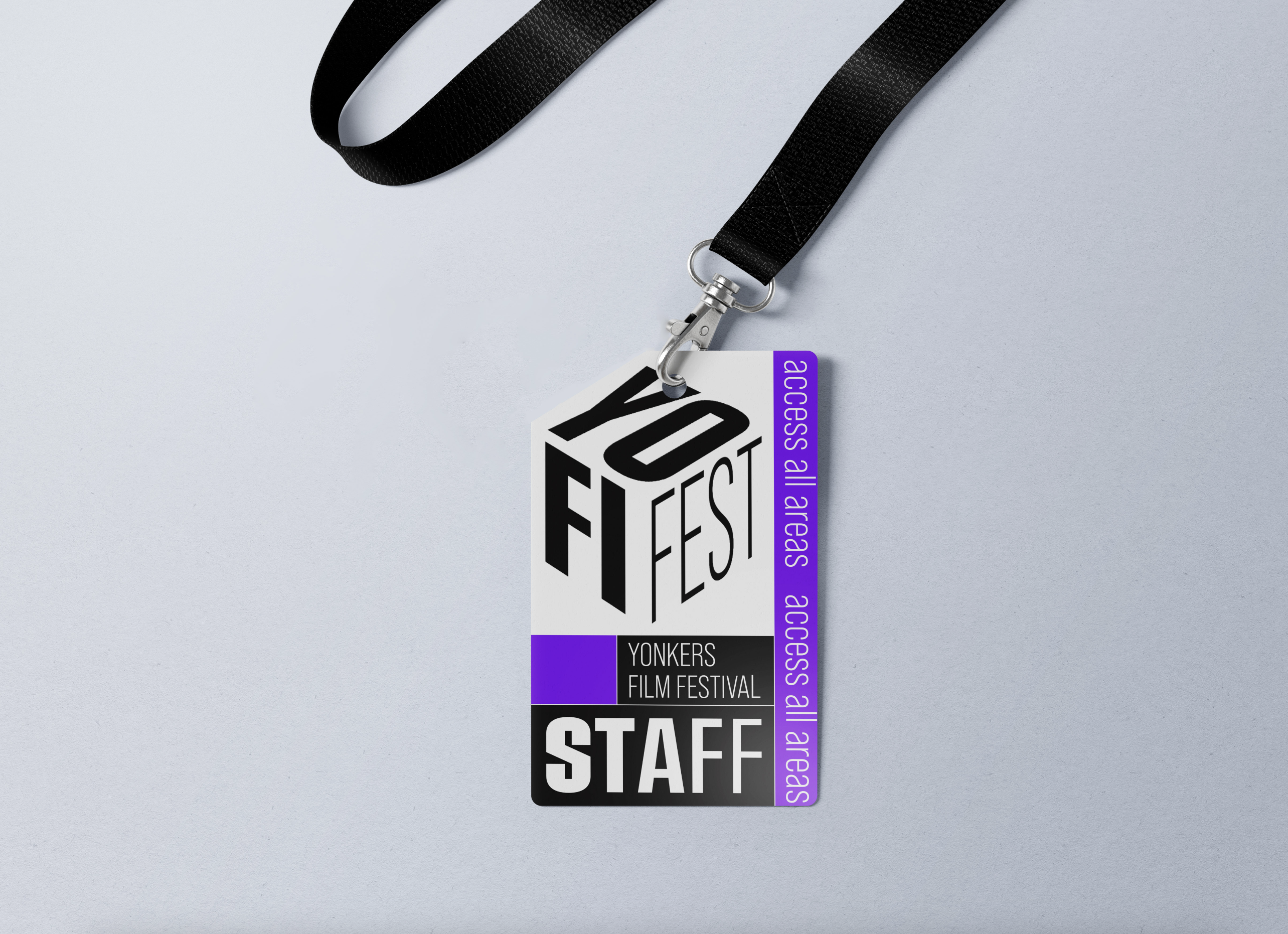
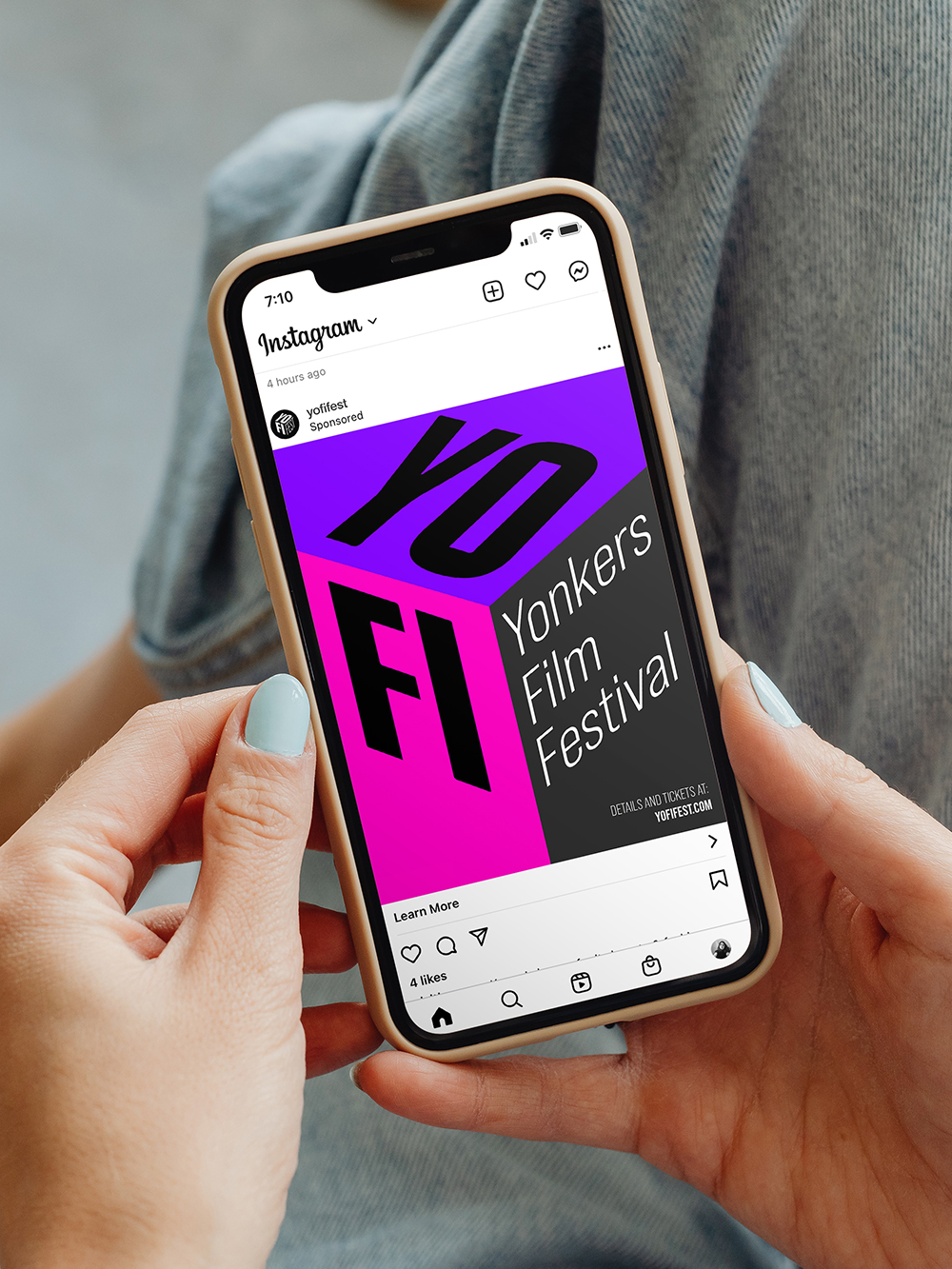
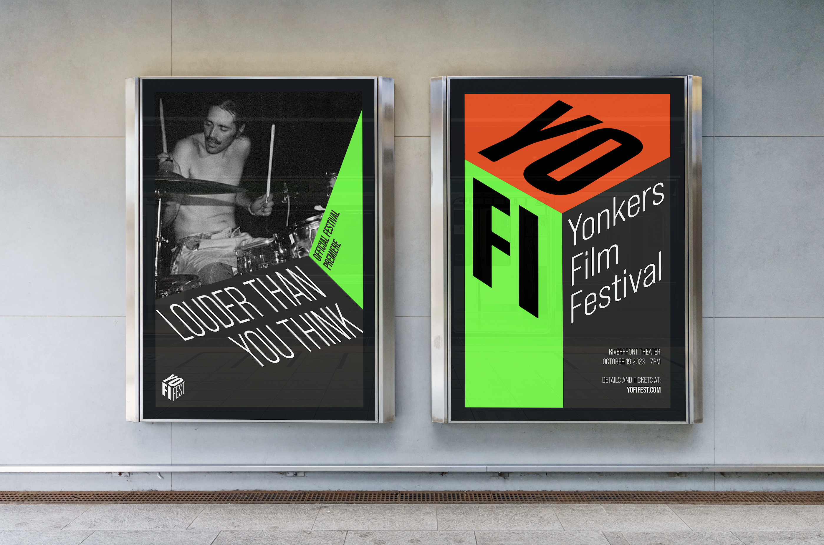
The final logo and branding system for YoFiFest broke the name of the festival onto different dimensional planes of a cube.
This unusual method created a distinctive look for the brand and a flexible shape for the addition of the many sub-brands of YoFiFest. The names of the sub-brands could be placed onto other planes surrounding the logo cube, creating playful shapes and entirely unique marks every time.
Team:
Creative Direction: Philip Byrne
Art Direction: Blathnaid Conroy
Design/Illustration: Niamh Murphy

 previous project
SEEKING SOMETHING ELSE?